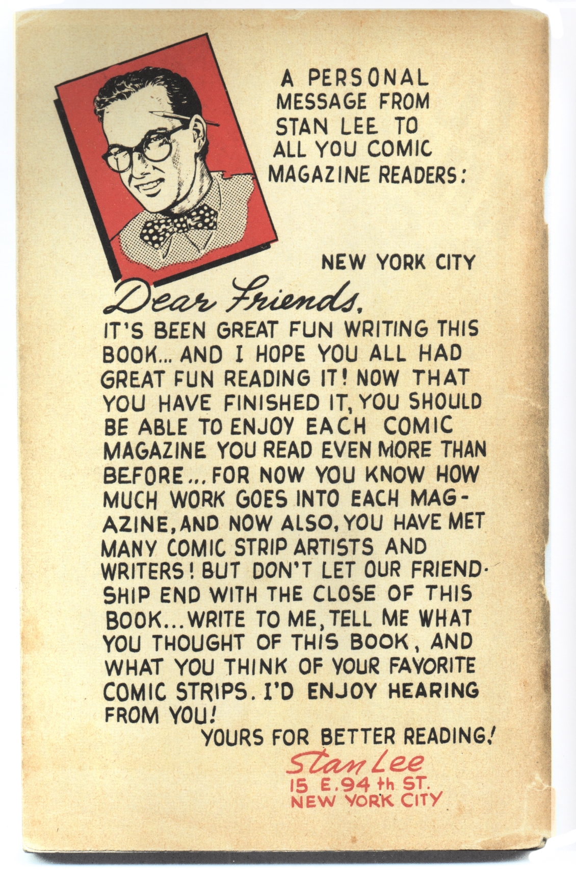
A guest post by Craig Fischer (sequel to an earlier post on the passing of Joe Sinnott). Thanks, Craig!
This is a revised version of an earlier essay I wrote about Joe Sinnott in 2008.
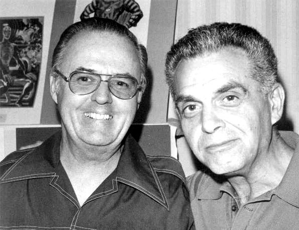
Joe Sinnott and Jack Kirby, 1975.
Although my parents bought me my first Joe Sinnott comic, Fantastic Four #80, in August 1968, I didn’t become a devoted Marvel reader until 1970. I missed the original Kirby-Stan Lee comics altogether, and reconnected with the FF again with issue #104, art by John Romita and John Verpoorten. I’d only see Sinnott inks again in FF #106 (“The Monster’s Secret!”), over Romita’s pencils. I found something compelling there, though, because I read The Fantastic Four every month for the next three-and-a-half years, up to the wedding of Crystal and Quicksilver in #150. Then I drifted away, but never completely: I’d occasionally check in with the title and Sinnott. As a young teen, I loved Sinnott’s inks over George Perez’s impossibly detailed pages in FF #172, and the John Byrne / Sinnott FF #287 re-ignited my interest in comic books after a period of giving them up—I’d entered graduate school in English and felt it was time to “get serious” about literature. Didn’t take.

Even as a kid, I recognized that Sinnott was the best of all Fantastic Four inkers. In the ’70s, as I read the contemporary post-Kirby FFs, I caught up on past issues through the reprints in Marvel’s Greatest Comics. (A sad irony: I eventually became a Kirby devotee by collecting Marvel’s avalanche of early-1970s Kirby reprints, even though these reprints forced Kirby to compete with himself on the newsstands as he produced his new, innovative DC Fourth World work.) For a while, I believed that Rich Buckler inked by Sinnott was more accomplished than Kirby inked by Vince Colletta. This was before I realized how much Buckler ripped off from Kirby, though even today Colletta’s inking in issues like FF #40 (“The Battle of the Baxter Building!”) still looks exceedingly rushed and shoddy to me.
I wasn’t the only one who found fault with the Kirby/Colletta Fantastic Four issues. According to Mark Evanier, Colletta lost the FF assignment when Marvel publisher Martin Goodman looked over Colletta’s work and asked Stan Lee, “How come our lead book looks like shit?” When production manager Sol Brodsky mentioned that with more money, he could find a better, more appropriate inker, Goodman coughed up a few extra dollars per page, and journeyman artist Joe Sinnott was hired to embellish Kirby’s pencils.
Sinnott was born in Saugerties, New York on October 16, 1926, and like many comics artists of his generation, he fell hard for newspaper adventure strips like Milton Caniff’s Terry and the Pirates, Alex Raymond’s Flash Gordon, and Lyman Young’s Tim Tyler’s Luck. After serving in the Navy in World War II and working for three years at the rock quarry of a cement plant, Sinnott enrolled in the School of Visual Arts in New York City, and was encouraged by Tarzan artist and SVA Dean Burne Hogarth to specialize in cartooning. One of Sinnott’s teachers was Tom Gill, a freelancer for Fawcett Publications and artist of the Lone Ranger comic strip. Gill liked Sinnott’s art and hired him as one of his assistants.
In 1950, Sinnott asked Lee, then editor at the company that would later become Marvel (and was at the time called either Timely or Atlas Comics), for work, and received crime and western stories to illustrate. When the downturn of the comics industry in the mid-1950s prompted Lee (and publisher Martin Goodman) to fire artists and reduce the page rates of the still-employed, Sinnott left ur-Marvel and found work with the Gilberton Company, the publisher of Classics Illustrated, and with Treasure Chest (1946-1972), a comic book published by George A. Pflaum distributed exclusively to Catholic schools. In 1958, with Atlas’ finances marginally improved, Lee rehired Sinnott to draw pre-Marvel monster comics, and until the mid-1960s Sinnott labored for several clients simultaneously, including Marvel, Charlton, Dell, and Treasure Chest. Although Sinnott both penciled and inked many of these assignments, he also began inking other artists’ pencils for Stan Lee. As Sinnott explained in an interview with Jim Amash published in Alter Ego #26 (2003):
Stan called me out of the blue and said, “I got a western story here that Jack [Kirby] can’t ink. Can you fit it into your schedule?” I told him to send it up; I wasn’t going into the city [NYC] anymore. I did everything by phone. A couple of weeks later, Stan called me and asked me to ink another Kirby story. Jack didn’t want to ink his stuff, and Stan needed someone to do it. Of course, you know Jack didn’t ink the way he penciled. Not to belittle his inking, but it detracted from his pencils. Those pencils were so good, but his inking wasn’t–at least, not in my opinion. Jack needed good inkers to make his work look the way it should.
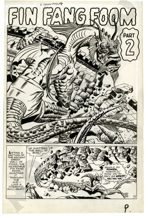
The first Fantastic Four comic Sinnott inked was issue #5 (July 1962), featuring the first appearance of Dr. Doom, although this would be Sinnott’s only real work on the title for the next three years. He returned with #44 (November 1965), replacing Colletta, stayed on for almost all the remaining issues of the Lee-Kirby run (through #102, September 1970), and continued to ink FF for several years after both Lee and Kirby left the comic.
Sinnott’s only penciling for Marvel in the 1960s is a handful of undistinguished stories that he drew and inked for Journey into Mystery starring Thor. In 1963, Marvel paid some of the worst rates in the industry, so it’s not surprising that Sinnott drew the Thor tales as fast as he could. When the money was reasonable, however, Sinnott slowed down and displayed several artistic strengths, particularly a detailed naturalism and textured inking style, that were best on display in his low-key stories for Treasure Chest. Below is a page he penciled and inked for a biography of Benjamin Banneker published in Treasure Chest in January 1969:

Most notable about the art is Sinnott’s brush inking. In the first panel, Banneker’s coat is mostly a pool of solid black, but Sinnott’s brush teases out thin lines from the darkness, guiding the reader’s eyes towards the center of the panel. The same feathery inking is in panel two, where Sinnott renders Banneker’s lower leg as a silhouette, and finishes off the shadow with lines that become thinner as they travel upward and end around Banneker’s waist. Sinnott’s facility with ink is also clear from his stippling with the brush in panels two and four. In panel two, the tree next to the cabin is a dense arrangement of short, thick ink marks, while the plants in panel four combine representational shapes (black silhouettes of leaves) with amorphous ink blobs that signify tree foliage.
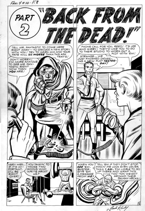
Sinnott brings this set of skills to his inking of Kirby’s FF pencils. Here are the original pencils and the final inked version of the first panel of page 19 of FF #89 (August 1969):

Sinnott adds details and softens Kirby’s pencils. Kirby draws Sue’s hair with uniform wavy lines; Sinnott inks in a fatter, more undulating line around the hair’s outline that identifies a definitive shape for the colorist and adds lines of various width and length to indicate individual strands, making Sue’s hair flow more. Sinnott also adds texture to fabric. The line that begins on Reed’s chest (near Sue’s finger) and extends to his shoulder is, in Kirby’s pencils, unbroken and of consistent width, but Sinnott inks the line as a band of razor-thin brush marks that culminate in a thick loop curving around Reed’s collar.
In a craft talk with Amash in The Jack Kirby Collector #38 (2003), Sinnott refers to these panels and explains his reasons for some of these embellishments:
The pages should always hold up in black-&-white. It’s not enough to have two “colors,” meaning black-&-white. You need to have midtones, which is why I’d feather out of black areas, turn slashes into feathering, and vary my line weights so much. Using thin lines and thick lines for wrinkles creates a gray area. Using thin groups of lines in Reed’s hair, then spotting a few black places makes a great contrast to the lower half, where Reed’s hair is white.
The thinner lines in Sue’s hair, then, show (even in black-and-white) that she is blonde rather than brown-haired like Reed. Techniques like this–and Sinnott’s overall attention to craft and his cultivation of realistic textures and marks–are legacies of his affection for newspaper adventure cartoonists, and his training as a realistic illustrator at SVA.
Ironically, the signature visual effect the Kirby-Sinnott team brought to The Fantastic Four is neither realistic nor rendered in midtones. “Kirby Krackle” is the term fans have coined to describe the thick black dots, surrounded by white space, in Kirby’s superhero and science-fiction comics (or in Kirby’s later comics, period). Kirby and Sinnott sometimes pepper their drawings of outer space with these dots, to emphasize the alien nature of their celestial vistas, but their most common use is in situations where a character or object is releasing unusual and powerful energy. In the following panel from Fantastic Four #61 (April 1967, as reprinted in The Essential Fantastic Four volume 3), the dots serve both functions, as Reed Richards plunges through a gateway of streaming energy into the other-worldly Negative Zone:

The origins of Kirby Krackle are elusive. Some see it in Blue Bolt Comics, a Kirby/Joe Simon superhero comic book published in 1940, while Ger Apeldoorn traces the technique back to an obscure science fiction story penciled and inked by Kirby in 1959. Sinnott claims that he used the dots even before he inked Kirby, but his solo crackle typically denotes real-life textures and objects, like the surface of water or the cluster of marks in Benjamin Banneker’s tree. Shane Foley points out that the amount of Kirby Krackle in FF increases exponentially beginning in late 1966, and from this moment on, both Kirby and Sinnott made the dots a permanent part of their visual vocabularies, even when they weren’t a pen-and-ink team.
Kirby’s great gifts as an artist were his dynamic compositions, his visual invention, and his uncanny ability to visualize people and objects from any angle in 360-degree space. His pencils, however, were never pretty in a conventional sense. Kirby never seemed interested in realistic depictions of the human form; both Sinnott and inker Mike Royer note that Kirby would usually draw faces with eyes askew from each other, and it was up to them to fix this mistake. Sinnott’s supple brush line, however, made Kirby’s characters human, and I wonder if Kirby himself fully realized this. Although he always said kind words about Sinnott, Kirby could be uncomfortable with inkers who changed too much of his source material. During his last tenure at DC (1970-75), Kirby’s resented that his drawings were retouched by other artists to resemble DC’s “official” version of Superman, and he also requested that Colletta be removed from his Fourth World titles. When Mike Royer inked his first Mister Miracle comic, he tried to “pretty up” the face of Kirby’s female powerhouse Big Barda. Kirby took an X-Acto knife, cut the face out of the surface of the paper, and instructed Royer to remain faithful to his pencils. I hope, though, that Kirby appreciated how Sinnott’s inks complimented his art in flattering ways.
In the past, I’ve been guilty myself of underestimating or misunderstanding Sinnott. After I resumed collecting comics in graduate school, I migrated from Marvel and DC Comics to black-and white alternatives: the Hernandez brothers’ Love and Rockets, Peter Bagge’s Neat Stuff, the stray late-’80s issues of the underground anthology title Snarf from Kitchen Sink Press. Only later, after striking up friendships with comics academics more perceptive than I and more tune with Kirby’s aesthetics (one of whom runs this blog) did I return to my worn copies of Marvel’s Greatest Comics, where I found power, grace, and profound memories of my evolving literacy. Joe Sinnott was part of all that.